

About
Designer. Illustrator. Level 5 Half-Elf Cleric.
my name is griffin.
Griffin Macaulay, to be exact — it's the "-mac" in griffmac. I go by Griff.
I majored in Communication Design from Kutztown University in central Pennsylvania with concentrations in Illustration, Graphic Design, and Interactive Design. Freelancing out of my apartment for the first year out of college, I began working contract and full-time design jobs in local agencies before being brought into the ranks of the Neo-Pangea Society. I am currently available for projects.
Beginning first as an illustrator, I shifted to print and type design, translated that to design for the web and games, and most recently dove headlong into user experience design. Every shift in focus is an adventure and helps better inform design decisions.
I get the most pride out of designing clever solutions and reinventing wheels. Overcoming adversity leads to personal growth, so I surround myself with other people who live to brave the unknown. More than anything, I want to make things that people love to use and remember fondly. Sound like something you're interested in, too?
non-screen design
Paper feels good to design on. Typography is still an addiction. I'll always draw stuff given the chance.
You've made it this far—these are the bonus designs that don't fall into the interactive category.

Poster design meant to remind participants of the way daily sprints are held. In reality, folks just really dig Star Wars. 18x24".
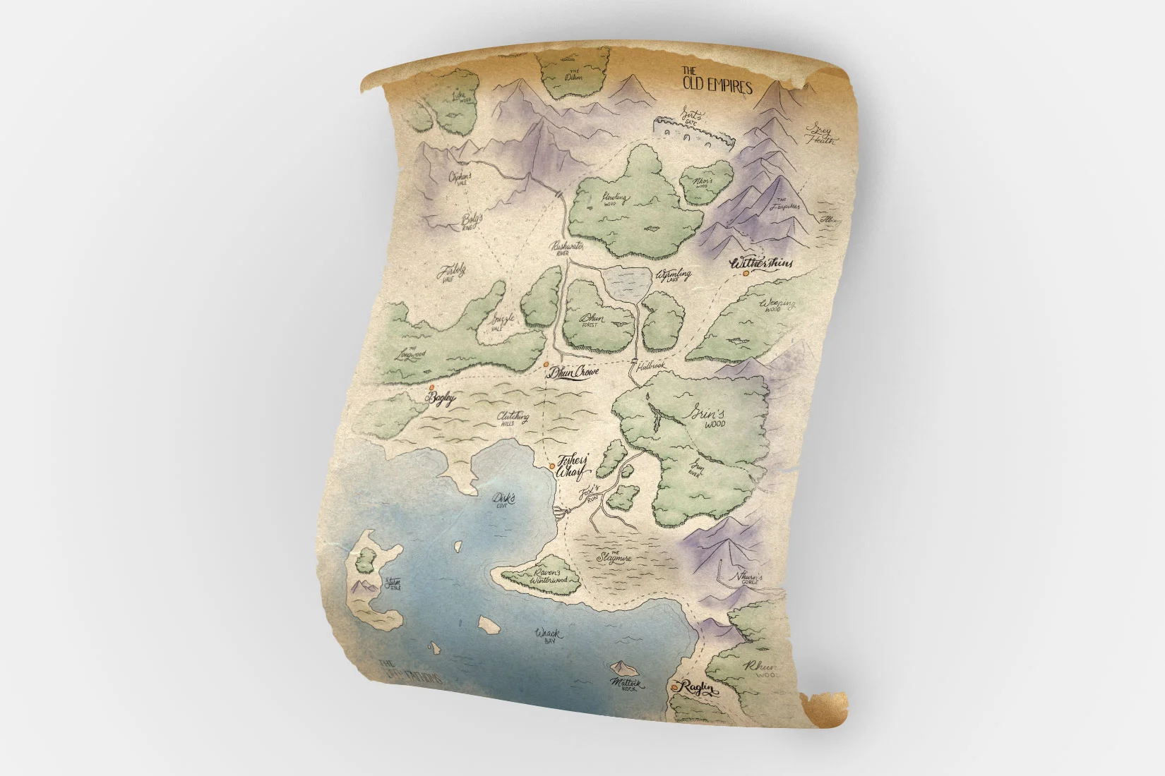
My party needed a map of the known world around them. If it's not Nick Offerman drinking scotch by a fire, we put the map up on the TV when we play. Made in the style of old map references.
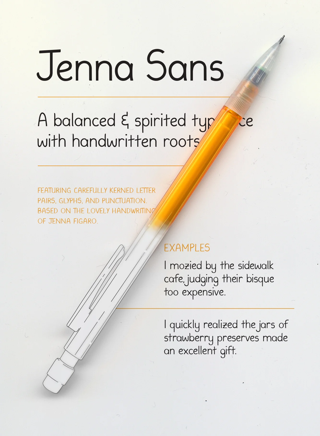
A good friend of mine wanted to convince his sister that art had purpose, and that her handwriting was a good example. He asked me to use samples of her handwriting to create a typeface, complete with punctuation and cases. It needed to stay true to form with her original handwriting, but also look consistent across characters. And, of course, built-in kerning.

A local inventor wanted to solve an apparently very real problem that slushie-enthusiasts are faced with by making a product of his own invention called Multi-cup. He needed a booklet to help sell the idea to investors, as well as branding and illustrations to demonstrate it.
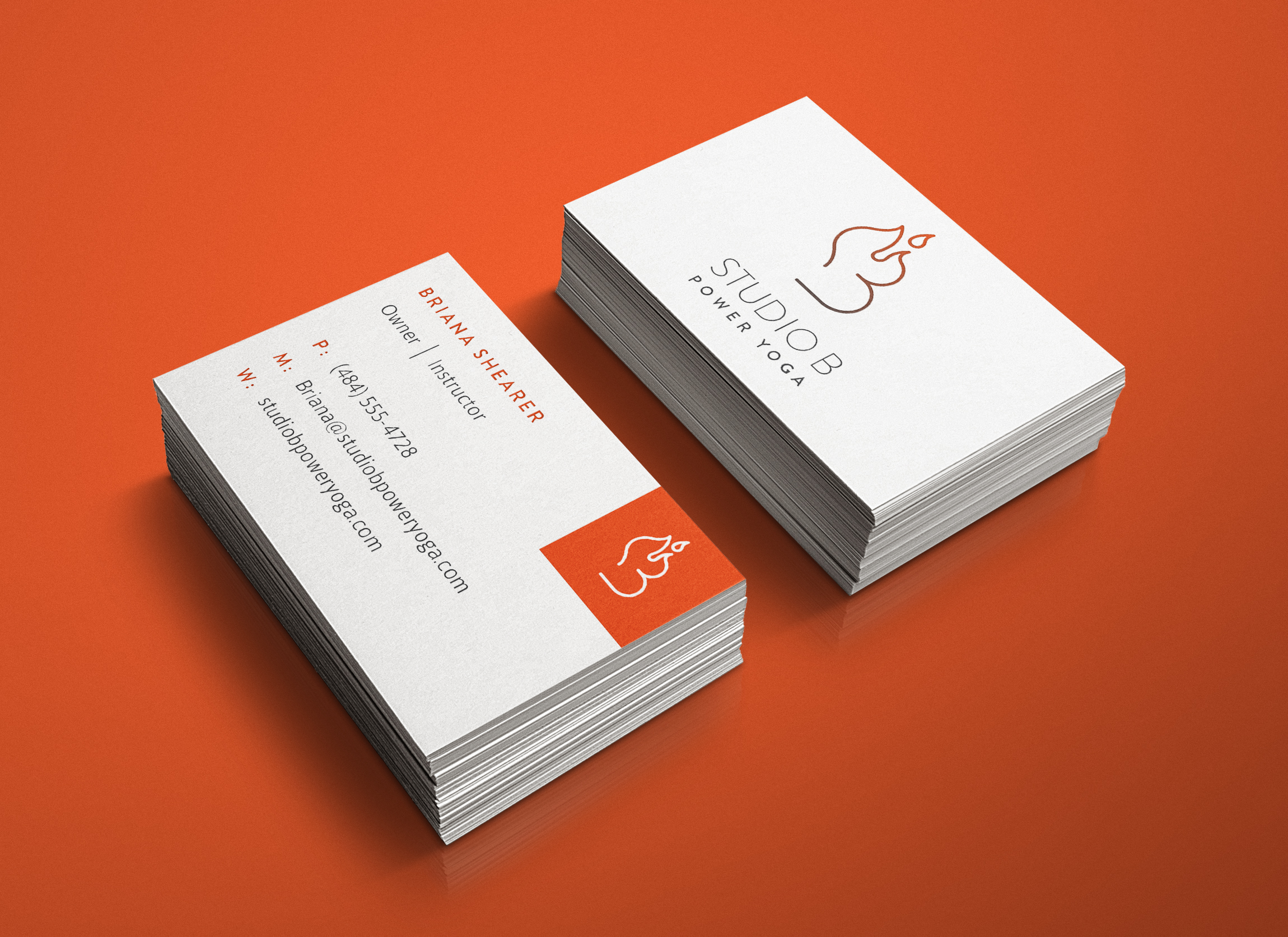
I was approached by a woman who needed branding made for her new power yoga studio. After getting a sense for her interests, her goals with the company, and how she ran the studio, I presented her with directions, which we refined into eventual final designs.

A remixed college project. This is a set of five coasters that feature palindromes written as ambigrams, meaning that the words are read the same forwards and backwards, and right-side-up or upside-down. Shown: tangy gnat.
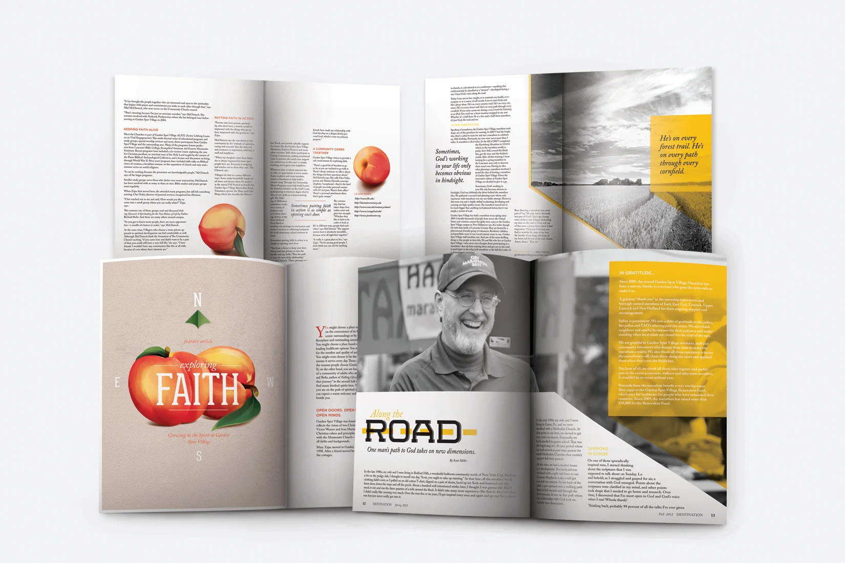
Garden Spot Village is a retirement community that is very committed to its residents. So much so that it prints out two editions of its local magazine every year to detail its activities and community spirit. I was given the opportunity to make both an Autumn and Spring issue design in 2014. Shown: Fall.

Garden Spot Village is a retirement community that is very committed to its residents. So much so that it prints out two editions of its local magazine every year to detail its activities and community spirit. I was given the opportunity to make both an Autumn and Spring issue design in 2014. Shown: Spring.
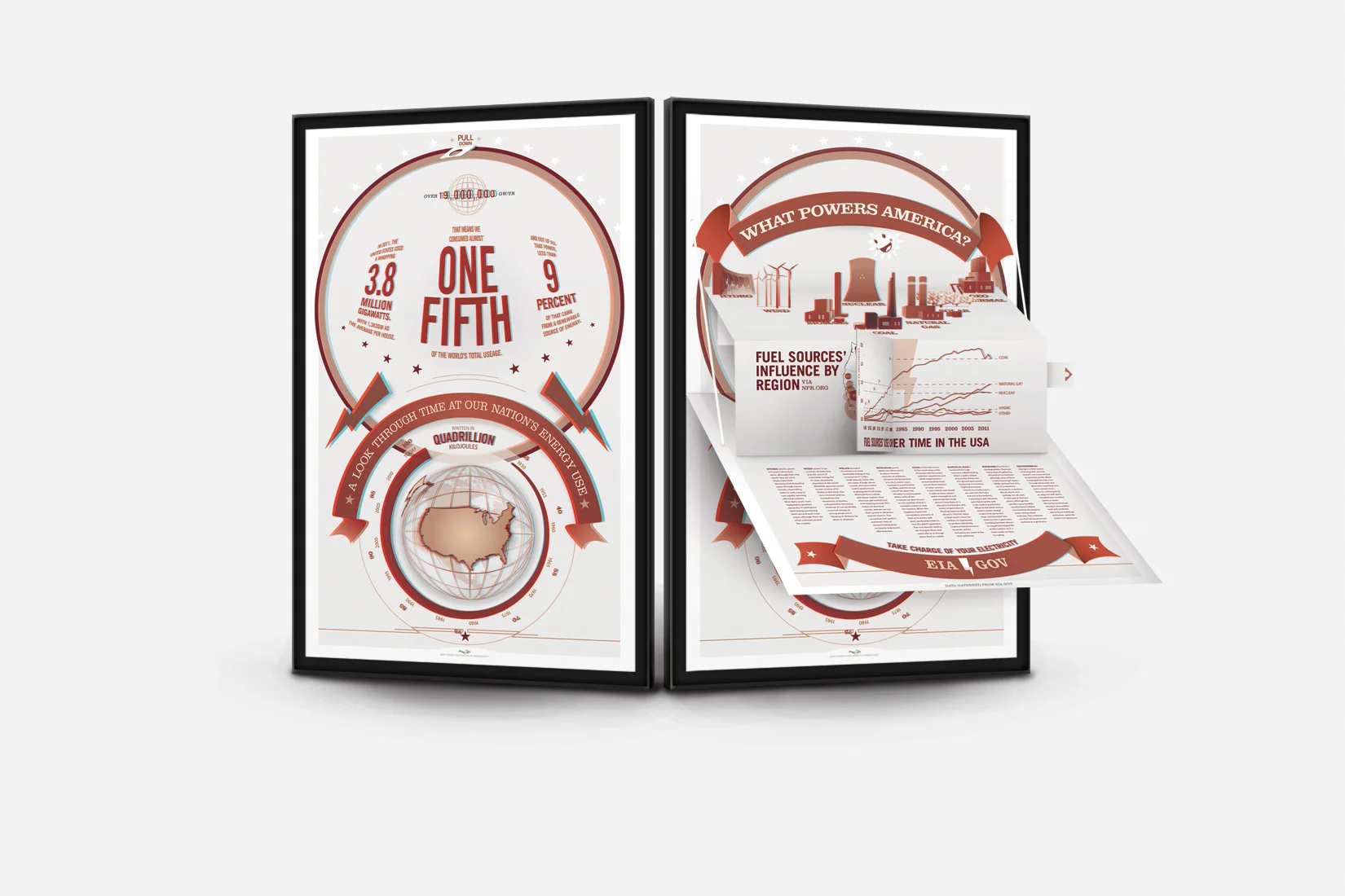
As an experiment in poster design, I combined the elements of a popup card with electricity-related infographics on a 26" tall poster. The poster, printed in red and cyan, was paired with classic red/cyan 3D glasses, which showed information to viewers at varying distances depending on its importance.

I like sharks. Apparently, I like sharks enough to make a typeface about it. All in lower-case, this font comes complete with punctuation and radical tail-like descenders and tubular dorsal-fin ascenders.